
Web design trends from the last 20 years

How has the look of websites changed over the last twenty years? Well, a lot. Usability expert Jared Poole once said, “Good design, when done well, becomes invisible. It’s only when it’s done poorly that we notice it.” Aesthetically speaking, what fits into that “good” bucket that Poole refers to typically changes as new technologies roll out and target audiences’ needs change. 

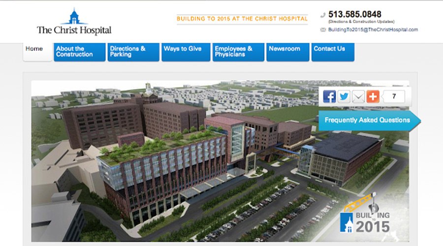
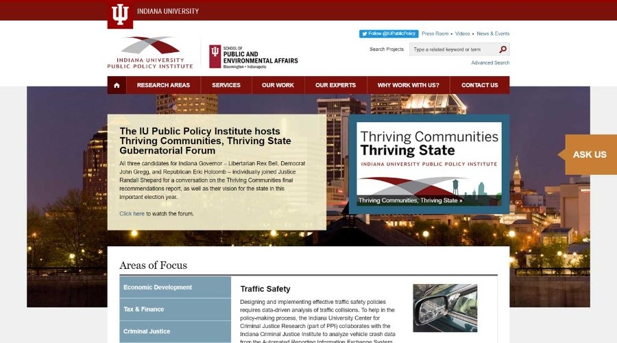
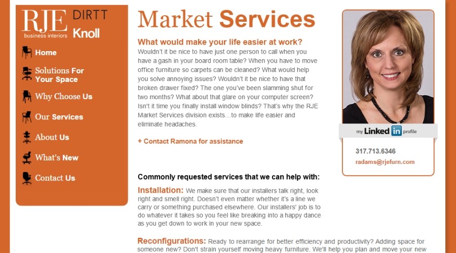
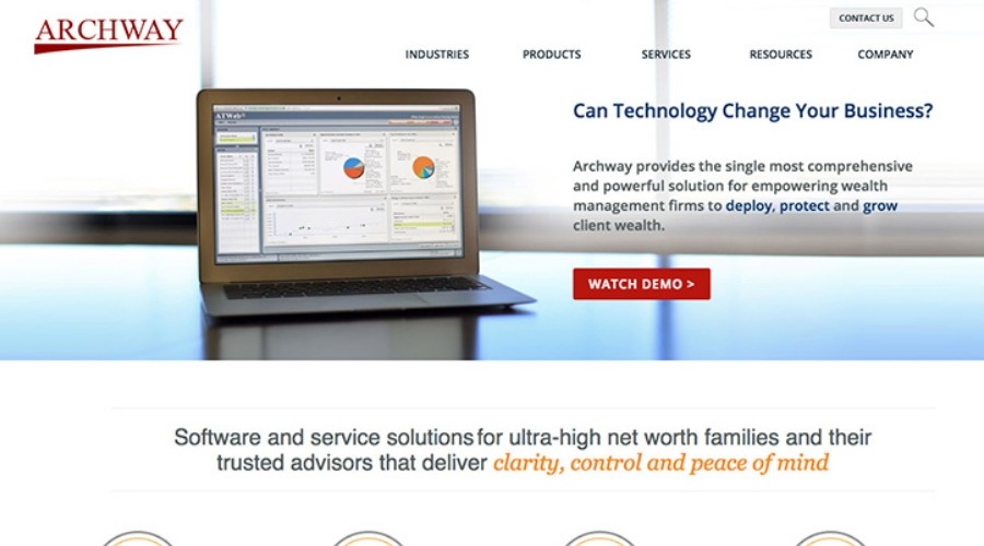
TBH Creative’s clients—knowing their website is a 24/7 salesperson and wanting to stay ahead of the competition—prioritize “good” web design and the user experience, regularly auditing their sites to ensure users always get what they need. Below are homepages from sites launched by TBH Creative from 2004–24.

2004–08

2004 web design example: Purdue Alumni Association homepage
Purdue Alumni Association
2005 web design example: Unitel homepage
Uni-Tel Communications Group
2005 web design example: Internal Medicine Associates homepage
Internal Medicine Associates
2006 web design example: Skillman homepage
The Skillman Corporation
2006 web design example: Technology Interiors homepage
Technology Interiors
2008 web design example: United Way of Central Indiana homepage
United Way of Central Indiana

In 2004, “Web 2.0” became ubiquitous, and it’s also when many notable technologies and websites from the past were born, including Google’s Gmail web app, TheFacebook.com, Ubuntu, Mozilla’s Firefox 1.0, and Apple’s AirPlay. The biggest web design trends during this period included Flash animations, word clouds, and RSS feeds. Website pages were pixel-perfect and designed to fit everything in one viewport with as much as possible above the fold.

2009–11

2010 web design example: Fundex Games homepage
Fundex Games
2010 web design example: Franciscan Alliance homepage
Franciscan Alliance
2011 web design example: BioStorage Technologies homepage
BioStorage Technologies

During this era of web design, grid-based layouts, and advanced visuals and interactions were often used. Homepage slider carousels, large background images, and skeuomorphic designs with realistic textures were also popular. Interactive features like JavaScript and jQuery enhanced user experiences. Web accessibility, social media integration, and fixed navigation bars began to be prioritized at this time.

2012–14

Responsive design became “a thing,” and many companies started prioritizing building mobile versions. As 2012 progressed, we saw a new trend of one-page layouts and large images. By 2014, a new standard for retina screens was changing the industry again. There was less talk of below the fold and more acceptance for scrolling.

2015–18

2015 web design example: Delco Remy International homepage
Delco Remy International
2015 web design example: Interactive Intelligence homepage
Interactive Intelligence
2017 web design example: Hickory Creek Healthcare homepage
Hickory Creek Healthcare
2018 web design example: Indiana Hemophilia and Thrombosis Center homepage
Indiana Hemophilia and Thrombosis Center

During this period, web design embraced animated GIFs and SVGs for richer visuals, while big hero graphics became a staple for impactful first impressions. Creative navigation techniques and parallax scrolling added depth and interactivity to websites. Responsive design was no longer considered just a trend once it became the standard as mobile phone usage surged, and—by 2018—over half of global web traffic came from mobile devices. This era marked a significant shift toward mobile-first design that embraced the concept of a digital fold and enhanced user engagement.

2019–21

In this short era of web design trends, more complex, larger websites became increasingly common, featuring more custom-designed pages and many template options. Advanced editor tools made site creation more accessible, though sometimes at the expense of performance. Brand identity on sites was enhanced with creative font usage. Dark mode designs became popular, offering a sleek aesthetic and reduced eye strain, aligning with device-wide dim color background themes.

2022–24

Many designers have recently embraced the “Bento Box” layout aesthetic (which uses a modular, card-based style that offers a clean, organized presentation of information) and minimalism (which is known for its increased use of negative space, bold typography, and smooth scroll animations). The use of dark-mode web design layouts and high-contrast graphics has become more mainstream, while neumorphism and glassmorphism have earned their rank among current trends of modern web design. Also, there’s been a significant effort to use design to improve website navigation through accessibility patterns (such as scalable fonts, customizable themes, and screen reader-friendly structures).

What’s coming next?

Looking ahead to the next five years, future website redesign projects will likely leverage AI and machine learning. Additionally, augmented reality (AR) and virtual reality (VR) are expected to become more prevalent in web designs, and the use of progressive web apps (PWAs) will continue to gain popularity. Optimizing page layout templates for faster page loading and lower energy consumption will be a greater focus. Strategic planning around web design decision-making (and how it connects with content organization, copywriting, and even site-build work) will also increase to ensure redesigned sites are even more flexible, accessible, and inclusive.